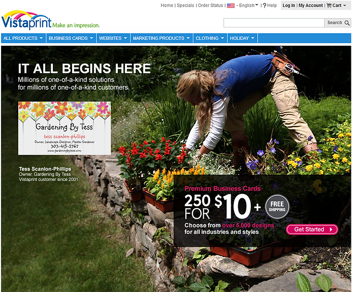

Vistaprint Landing Pages
I was lucky to be able to lead an effort at Vistaprint for about a year and a half to rethink some of their top landing pages for various marketing channels. Applying basic channel-specific best practices along with some of my favorite visual tricks, yielded some huge wins that accounted for hundreds of thousands of dollars in RMR. To the left is a small sample from that effort.
Some tactics used:
-
Visual Cues - using imagery and design elements to lead the users eye where you want them to look
-
Reducing Exit Points - depending on the channel, simple things like suppressing the navigation and any other links not directly related to conversion can make a big difference
-
White Space - Never underestimate the power of unused space. It helps to direct focus to one place or another
-
Focusing on the intent - Pages with a singular focus take less time for users to understand. Less options mean less time spent making a decision, which means less time spent on the page, and creates less of a barrier to conversion.

